
Keeping Polo Logo Colours Consistent Across Embroidery and Print
An embroidered chest emblem and a full-colour printed back graphic can share artwork but rarely use identical materials. The thread reflects light, the printed ink or film sits on the textile surface and garment colour influences both. Procurement teams need a practical approval system so a company polo looks coordinated even when different decorations are ordered in separate batches.
Start with a hierarchy of acceptable colours
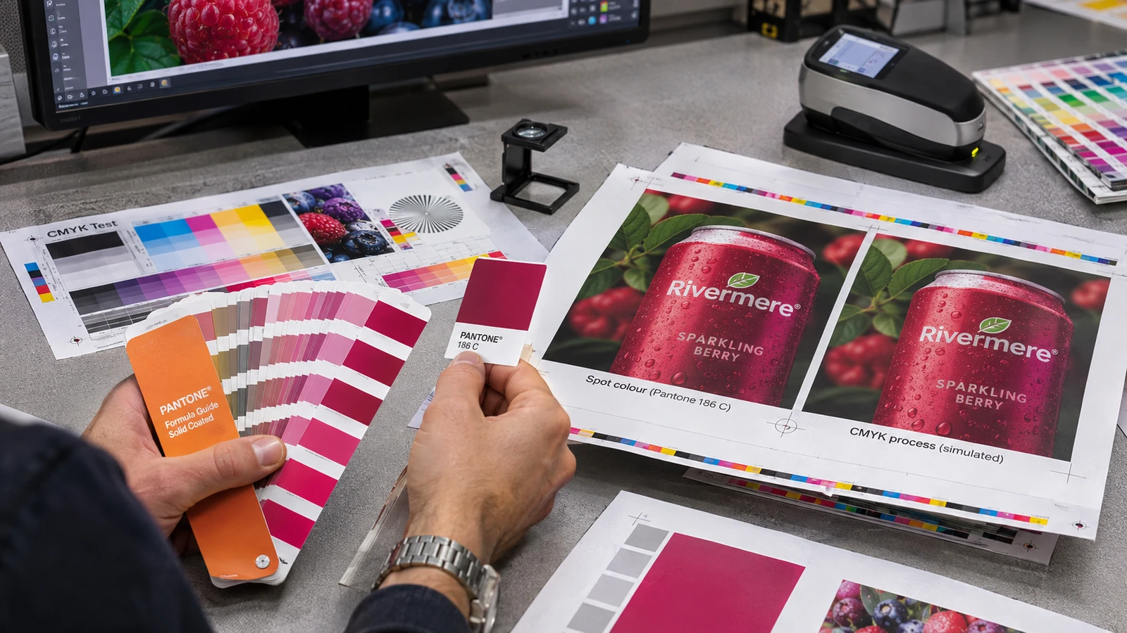
Ask the brand owner which one or two colours matter most and whether a close visual approximation is acceptable. A reference created for a glowing RGB screen is not automatically reproducible in thread or printing. Choose a physical approved logo sample when possible, and record the intended fabric colour. Identical numerical values on different materials do not guarantee an identical appearance.
For the purchase approval, compare reference swatches beside the intended garment in the same lighting. This is worth recording before the design is signed off, because if no one defines acceptable variation, a technically sound order can still be rejected.
Recognise the limitations of embroidery thread
Thread colour is selected from the available range; stitch angle, thread sheen, density and backing can change perceived tone. Small outlines may close up when translated from artwork into stitches. The embroidered result should therefore be evaluated as a garment decoration, not a miniature colour chart. A patch and direct embroidery can also reflect light differently.
A useful verification step is to approve a sewn sample with the chosen thread and stitch scale on matching fabric. The practical reason for that check is that a perfect-looking digital embroidery mockup may hide filled letters or an unexpected sheen.
Check printed decoration on each garment shade
A DTF transfer or screen-printed motif may look different on a dark navy polo and a pale grey polo because opacity and surrounding contrast vary. Request a sample using the final garment shade, especially where white underbase or transparent effects are involved. Compare text weight and fine lines along with colour. The logo should remain recognisable at actual wearing distance.
During the production review, photograph print placement but judge colour against the physical sample in person. Skipping this step can cause a surprisingly expensive problem: an image taken under warm room light should not become the only approval reference.
Separate artwork approval from production approval
Confirm the master vector file, stated colours and dimensions first. Then approve the printed or embroidered production sample after deciding its method. Artwork sign-off means the logo geometry is correct; it does not prove that thread, ink, textile and placement will match expectations. Record both approvals rather than collapsing them into one message.
The team should also keep an annotated approval sheet listing technique, material, placement and final size. Treat this as part of the specification rather than an informal preference, since a supplier can follow a file exactly while producing a result that was never physically approved.
Consider repeat orders with substitute base shirts
Uniform brands sometimes change available colours, fabrics or garment cuts. A logo that matched an earlier navy may stand out differently on a slightly warmer replacement. When stock is substituted, request a fresh decoration comparison. Do not assume that two garments described as “royal blue” have identical dye shades.
Before a supplier prepares the final proof, identify which garment models were used with the previously approved thread and transfer. The risk is operational as much as visual: unrecorded substitutions lead to visibly different uniforms within one team.
Write a usable cross-method tolerance note
A useful specification states the priority colour, approved physical sample, garment background, logo dimensions and whether minor tonal variation between thread and print is permitted. State any non-negotiable readability requirements. Also document when additional physical proofing is required, such as a new garment shade or a larger chest emblem.
For a repeat order, ask the buyer and production contact to sign the same revised sample sheet. Keep the result with the approved sample, since the phrase “must match perfectly” is ambiguous without material and viewing conditions.
Practical example: making the decision
Imagine a company ordering navy polos with an embroidered left-chest emblem and printed event shirts using the same corporate blue. The marketing team supplies a vector logo, but the embroidered thread book lacks an exact match for the screen reference. They agree which approved thread is visually closest under neutral lighting and retain a stitched sample. A printed transfer is then compared against that sample on the final polo colour, with attention to legibility rather than a claim of perfect colour identity. The buyer files both samples alongside the garment model and artwork revision. Six months later, a new stock shade is proposed; the purchasing team knows to request a fresh comparison rather than repeating the previous job blindly. The example illustrates a controlled family resemblance across materials, not a guarantee that all production methods reproduce one colour exactly.
Additional approval considerations
A brand owner can simplify cross-method comparison by defining what must stay exact and what can be adapted. The logo silhouette, word spacing and minimum contrast may be non-negotiable, while perceived colour brightness may vary with the production medium. Put this distinction in writing before asking a printer to quote; otherwise even a good supplier has to guess how strictly to prioritise fidelity.
Embroidery digitisation can also change the thickness of letters and fine gaps. A thread sample should therefore be assessed for both colour and legibility. A tiny monogram that works beautifully as vector artwork may need a slightly larger stitched version. Approving that adaptation is more constructive than repeatedly requesting a colour change to solve what is actually a scale problem.
- Compare reference swatches beside the intended garment in the same lighting.
- Approve a sewn sample with the chosen thread and stitch scale on matching fabric.
- Photograph print placement but judge colour against the physical sample in person.
- Keep an annotated approval sheet listing technique, material, placement and final size.
- Identify which garment models were used with the previously approved thread and transfer.
- Ask the buyer and production contact to sign the same revised sample sheet.
Frequently asked questions
Can embroidery exactly match a printed logo?
Exact visual identity is not guaranteed because materials, sheen and colour ranges differ.
Should I use RGB values for thread selection?
Use them only as a starting reference; approve actual available thread samples.
Does the garment colour matter?
Yes. Contrast and perceived hue depend on the underlying fabric.
What matters for a repeat order?
Keep the approved sample, base shirt SKU, colour, artwork size and production method.
For a quotation based on the actual garment, print method, quantity and delivery location, review UniformJohor services and use the official enquiry page. Prices, methods, production schedules and minimum quantities must be confirmed for the specific job.