
Skudai Countertop Promotion Cards: Sizing Signs for Busy Retail Counters
A countertop sign gets only a few seconds of attention. For a Skudai retailer explaining a launch offer, membership programme or collection procedure, a display that looks attractive on a computer screen can fail once surrounded by merchandise and payment terminals. This article gives a practical way to select A5 or A4 size, write the message, check contrast and plan a stable display without assuming every counter has the same layout.
Observe where the customer actually stands
Before choosing artwork dimensions, measure the space between the payment terminal, packing area and customer-facing edge. A display placed behind tall products might be invisible even if the type size is generous. Decide whether the message is for customers queuing at one metre or people browsing several steps away. Those are different reading conditions.
For the purchase approval, photograph the empty counter from a customer’s eye level and mark competing objects. This is worth recording before the design is signed off, because a larger sign can obstruct staff sightlines or crowd the payment area rather than improve response.
Use one headline and one next action
Counter cards perform best when customers can identify what is being offered and what to do next without reading a dense paragraph. Put a simple benefit or category above a concise instruction such as asking staff, scanning a code or viewing a collection. Any eligibility or expiry conditions must still be accurate and available, not hidden deliberately.
A useful verification step is to print the headline at actual size and test whether a colleague reads it quickly. The practical reason for that check is that shrinking the terms until they become illegible risks confusion and complaints.
Choose A5 or A4 by distance and clearance
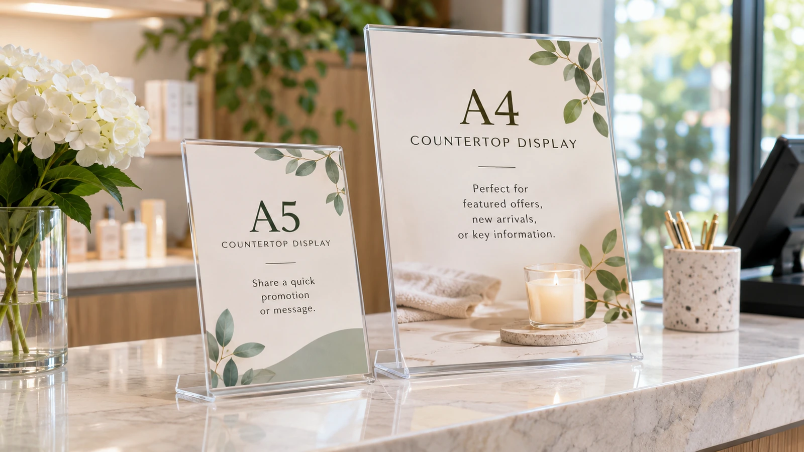
A5 may be easier on a narrow checkout counter; A4 can provide more visual space when the display is set farther back. Orientation changes how the sign fits beside point-of-sale equipment. Measure holder dimensions separately from paper dimensions and leave tolerance for its base. A folded self-standing card and a clear acrylic holder also behave differently under air conditioning.
During the production review, test a blank paper dummy in the intended stand before authorising a bulk print. Skipping this step can cause a surprisingly expensive problem: ordering a nominal A4 design without checking the holder opening can require trimming.
Protect QR codes from reflections and folds
A QR code should be positioned on a flat, accessible face with sufficient white space and contrast. Customers should not need to lift a heavy sign or lean over a cashier to scan it. Laminated gloss and acrylic sleeves can reflect overhead lights; scanning through a curve or near a fold may be unreliable.
The team should also scan the final physical proof using several common phones under store lighting. Treat this as part of the specification rather than an informal preference, since a code that works on an office monitor may fail once printed small behind reflective plastic.
Select a material that tolerates daily handling
Counters are touched, wiped and bumped. Thick paper inside a replaceable stand may be suitable for short campaigns, while a rigid mounted display may be easier to keep upright for a longer period. Ask about print finish and cleaning compatibility before choosing a coating. Do not assume that any unlaminated card will withstand a wet-cloth routine.
Before a supplier prepares the final proof, rub a test copy with the cleaning procedure actually used at the counter. The risk is operational as much as visual: edges that curl or smear can make a current promotion look out of date.
Keep offers and revisions under control
Designers should name the final proof with a date and revision, while store managers confirm pricing, validity and terms before printing. When the campaign ends, remove all copies and archive the approved artwork. A small change to an offer can otherwise leave different branches displaying different conditions. Print quantity should reflect the number of active counters plus a sensible spare allowance.
For a repeat order, identify who signs off promotion wording and who replaces old display stock. Keep the result with the approved sample, since an attractive sign is still a liability if its information is inaccurate or expired.
Practical example: making the decision
A hypothetical Skudai retailer wants to promote a new membership benefit at two checkout stations. The designer initially proposes an A4 card packed with photographs and small eligibility text. A paper dummy shows that it blocks the payment terminal and is partly hidden by a display tray. The team changes to a narrow A5 landscape card with a clear headline, one short instruction and a QR code positioned away from the acrylic holder's curve. Employees test the code under actual counter lighting and discover that the glossy sleeve creates a reflection at one station. They change that holder rather than shrinking the QR code. The approved file records the promotion end date and the person responsible for taking down the card. The exercise shows that a smaller, correctly placed sign can be more useful than a bigger advertisement with too much information.
Additional approval considerations
The visible face of a counter sign is not the same as its printed sheet dimensions. Some holders hide several millimetres at the bottom, while others tilt the card so overhead light lands directly on the main message. Ask for the holder's actual viewable opening and test the sign after inserting it, not just after printing.
Accessibility deserves attention even for short campaigns. If a small QR code is the only path to a product catalogue, customers unable to scan should have an alternative, such as a short URL or clear request to staff. Make sure the fallback is genuinely usable and maintained, not a decorative line added simply to fill empty space on the artwork.
- Photograph the empty counter from a customer’s eye level and mark competing objects.
- Print the headline at actual size and test whether a colleague reads it quickly.
- Test a blank paper dummy in the intended stand before authorising a bulk print.
- Scan the final physical proof using several common phones under store lighting.
- Rub a test copy with the cleaning procedure actually used at the counter.
- Identify who signs off promotion wording and who replaces old display stock.
Frequently asked questions
Which is better for a small counter, A5 or A4?
Choose based on measured clearance and customer reading distance, not just design preference.
Can a QR code appear behind acrylic?
Yes if it remains flat and scannable under real lighting; test the finished holder.
Should I laminate a short campaign card?
It depends on expected handling, cleaning and campaign duration; request a material sample.
Does this article promise Skudai walk-in collection?
No. Enquire with Uniform Johor for actual production and delivery arrangements.
For a quotation based on the actual garment, print method, quantity and delivery location, review UniformJohor services and use the official enquiry page. Prices, methods, production schedules and minimum quantities must be confirmed for the specific job.