
Embroidery Services Johor
How to Choose Thread Colours for Embroidery
Choose embroidery thread colours that stay readable, match your brand and look balanced on polos, jackets, caps and company shirts.
Direct answer: start with contrast. A thread colour should be clearly visible against the garment from normal viewing distance. Then match the logo as closely as practical using the embroidery thread chart, not only an RGB or CMYK value from a screen. Check the actual garment colour, thread sheen, logo size and stitch density before approving the final combination. If an exact brand shade is not available, choose the closest approved thread or prepare a simplified one-colour logo version.
Quick Comparison
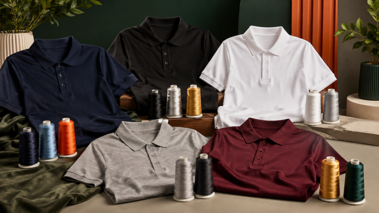
Thread Colour Choices by Garment Colour
Contrast is usually the fastest way to judge whether a logo will remain clear after embroidery.
| Garment Colour | Strong Thread Directions | Use With Care | Main Reason |
|---|---|---|---|
| Black | White, silver, gold, bright brand colours | Dark navy, charcoal, deep green | Low-contrast dark threads can disappear |
| Navy | White, light grey, gold, orange, light blue | Black, dark purple, deep green | Dark colours may merge visually |
| White | Black, navy, red, green, dark brand colours | Very pale grey, cream, pastel yellow | Light threads can lose definition |
| Grey | Black, navy, white, red, strong accent colours | Similar mid-grey thread | Tonal combinations need deliberate contrast |
| Maroon | White, cream, gold, light grey | Dark red, brown, black | Warm dark tones can blend together |
High Contrast
Best when the logo must be visible quickly from several metres away.
Tonal Embroidery
Similar shirt and thread colours can look premium, but visibility becomes intentionally subtle.
Brand-Matched Thread
Use the thread chart and physical sample to choose the nearest approved brand colour.
Uniform Options
Thread Colour Can Change by Garment Type
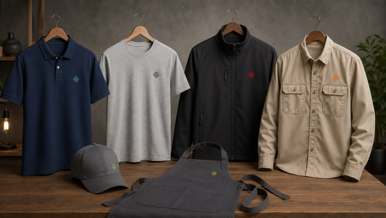
The same logo may need slightly different thread treatment on a polo, jacket or cap because fabric texture and garment colour affect how the stitches are seen.
Polo Shirts
Small left-chest logos work best with clear contrast and simplified detail.
Round-Neck T-Shirts
Lightweight fabric may need a smaller, less dense design, so thread colours should remain easy to read without extra detail.
Jackets
Dark outerwear often suits white, silver, gold or strong brand colours with higher contrast.
Caps
Curved surfaces favour bold logo shapes and strong thread contrast over very fine colour details.
Aprons
Choose thread colours that remain visible after frequent use and match the restaurant or service brand.
Work Shirts
Practical colour combinations should remain readable without making the logo look overly decorative.
| Uniform Type | Thread Priority | Typical Direction |
|---|---|---|
| Corporate polo | Professional clarity | Brand colour plus strong contrast |
| Event T-shirt | Simple recognition | One or two bold thread colours |
| Manager jacket | Premium appearance | White, silver, gold or approved brand colours |
| Cap | Visibility on a curved panel | High-contrast simplified logo |
Printing and Branding
Embroidery Colour Works Differently From Print Colour
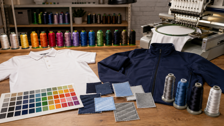
DTF and silkscreen use printed colour systems, while embroidery uses physical thread. That means an on-screen logo colour may not have an identical thread equivalent.
Physical Thread Matching
Use the embroidery thread chart or actual thread cone as the final colour reference.
Thread Sheen
Embroidery thread reflects light, so the same shade can appear lighter or darker from different angles.
Stitch Direction
Stitch angle affects how light catches the thread and can change the perceived colour slightly.
| Colour Reference | Usefulness for Embroidery | Best Practice |
|---|---|---|
| RGB | Useful for screen reference | Do not treat it as an exact thread match |
| CMYK | Useful for printed artwork | Translate to the nearest physical thread colour |
| Pantone reference | Helpful target where available | Compare against the thread supplier's nearest shade |
| Physical thread chart | Best practical reference | Approve the actual thread shade on the garment colour |
- Do not approve thread colour from a phone screen alone.
- Do not assume RGB, CMYK and thread colours will match exactly.
- Do not use too many similar dark shades in a very small logo.
- Do not keep tiny colour details that cannot be stitched clearly.

Material, Colour and Design
How to Build a Better Embroidery Colour Palette
Start With the Main Logo Colour
Identify the colour that carries the strongest brand recognition.
Add Contrast
Make sure text and symbols do not disappear into the garment.
Limit Small-Logo Colours
Fewer colours can make a small embroidered logo cleaner and more legible.
Check Fabric Texture
Pique, eyelet, fleece and woven fabric can all change how the stitched colour is perceived.
Review Light and Dark Versions
One logo colourway may not work equally well on both black and white garments.
Approve the Final Sample
Physical embroidery on the chosen garment is the best final check.
| Logo Situation | Better Colour Strategy |
|---|---|
| Multi-colour logo on dark polo | Keep brand colours, but lighten any details that disappear into the shirt |
| Small logo with tiny text | Reduce colours and increase contrast |
| One-colour corporate logo | Choose the strongest approved contrasting shade |
| Premium tonal branding | Use a thread only slightly lighter or darker than the garment |
| Same logo across many shirt colours | Prepare light-garment and dark-garment embroidery versions |
Ordering Process
How to Approve Embroidery Thread Colours
- Send the original logo. Vector artwork is especially useful for identifying clean colour areas.
- Confirm the garment colour. Thread should be selected against the actual shirt, jacket or cap shade.
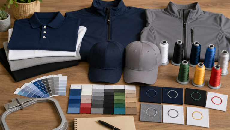
- Choose the nearest thread shades. Match brand colours using a physical embroidery thread chart.
- Check contrast and readability. Make sure wording and symbols are visible from normal viewing distance.
- Simplify if necessary. Remove tiny colour details that cannot be stitched cleanly.
- Approve a sample or stitch-out. Review colour, size, placement and overall appearance before the main order.
Dark Uniforms
Start with white, silver, gold or bright brand colours for stronger contrast.
Light Uniforms
Dark navy, black, maroon, green and other deeper shades usually read clearly.
Many Garment Colours
Prepare two approved embroidery versions instead of forcing one thread set onto every shirt.
Buyer Checklist
Before Confirming Embroidery Colours
- Confirm the exact garment colour
- Send the original logo artwork
- Identify the main brand colours
- Check contrast from normal viewing distance
- Compare physical thread shades rather than screen colour alone
- Simplify tiny details where necessary
- Prepare light- and dark-garment versions if needed
- Approve the final stitch-out or embroidery sample
Should embroidery thread match the logo exactly?
Match as closely as practical, but exact digital colours may not exist as physical thread shades. Use the nearest approved thread from the supplier chart.
Why does thread look different from the screen?
Screens emit light, while embroidery thread reflects light. Thread sheen and stitch direction can also change the perceived shade.
What thread colour works best on black shirts?
White, silver, gold and brighter brand colours usually provide strong visibility on black.
Can I use the same embroidery colours on every shirt colour?
Sometimes, but not always. A thread set that looks clear on white may disappear on navy or black. Two approved versions can be more consistent.
How many colours should a small embroidered logo use?
There is no fixed number, but fewer well-separated colours often make a small logo cleaner and easier to read.
Are metallic threads suitable for every logo?
No. Metallic effects can suit selected premium designs, but they should be reviewed for detail, fabric and stitch density before approval.
Embroidery Colour Matching
Need Help Choosing Thread Colours?
Send the logo, garment type, shirt colour and intended embroidery position. Uniform Johor can help plan a clear, practical thread colour combination for your project.
Related Uniform Johor Articles
Regional Network
Our Other Company Websites
JC Print Malaysia
Main company website for uniforms and printing services.
Visit website →SelangorPrint
Uniform and custom printing support for Selangor buyers.
Visit website →Uniform Penang
Uniform and apparel resources for Penang customers.
Visit website →Uniform Sabah
Uniform and custom apparel resources for Sabah buyers.
Visit website →Uniform Singapore
Uniform and apparel printing information for Singapore.
Visit website →Uniform Hub Singapore
Additional uniform resources for Singapore organisations.
Visit website →Tanah Studio
Apparel and creative services for the Australian market.
Visit website →KitaPrint
Printing support for agents and resellers.
Visit website →